Introduction
For this project I volunteered my time and skills for We Connect the Dots in order to redesign their website. We Connect the Dots is a non-profit organization that educates students about Science, Technology, Engineering, Arts and Math (STEAM) careers. WCTD provides awareness and education to students in order to prepare them for STEAM careers. I collaborated with five other designers in order to redesign the website. WCTD was looking for a more user friendly design that would help drive more donations and make it easier for students to learn and sign up for programs.
Research Process
We began the research process by creating a survey to be sent out to students, parents and donors to find out what the pain points are for the current site and to better determine at which point they were bouncing from the site. This helped determine the biggest issues users were having with the current site and which pain points needed to be addressed. We also conducted interviews and did some user testing on the current site to see how users were interacting with the site. From these two processes, we found that most users were having a hard time navigating the site. They were unsure on where they would go to find out certain information and it took them too long to finally find what they were looking for. Also it was discovered that users were having a hard time figuring out how to register for a program.
A competitive analysis was conducted looking at other educational websites and non-profit sites. Looking at these other sites helped show that the WCTD site was not easy to navigate. By looking at the other sites it helped show more intuitive ways to design the site so users could more easily navigate the site and be called to action when on the site.
WCTD has three primary users. Students looking for information on STEAM education and programs, parents looking for programs for their children and donors looking to donate either money or their time by volunteering. By creating three different user personas based on these primary users, I was ready to begin the design process in order to design for these three users.
Design Process
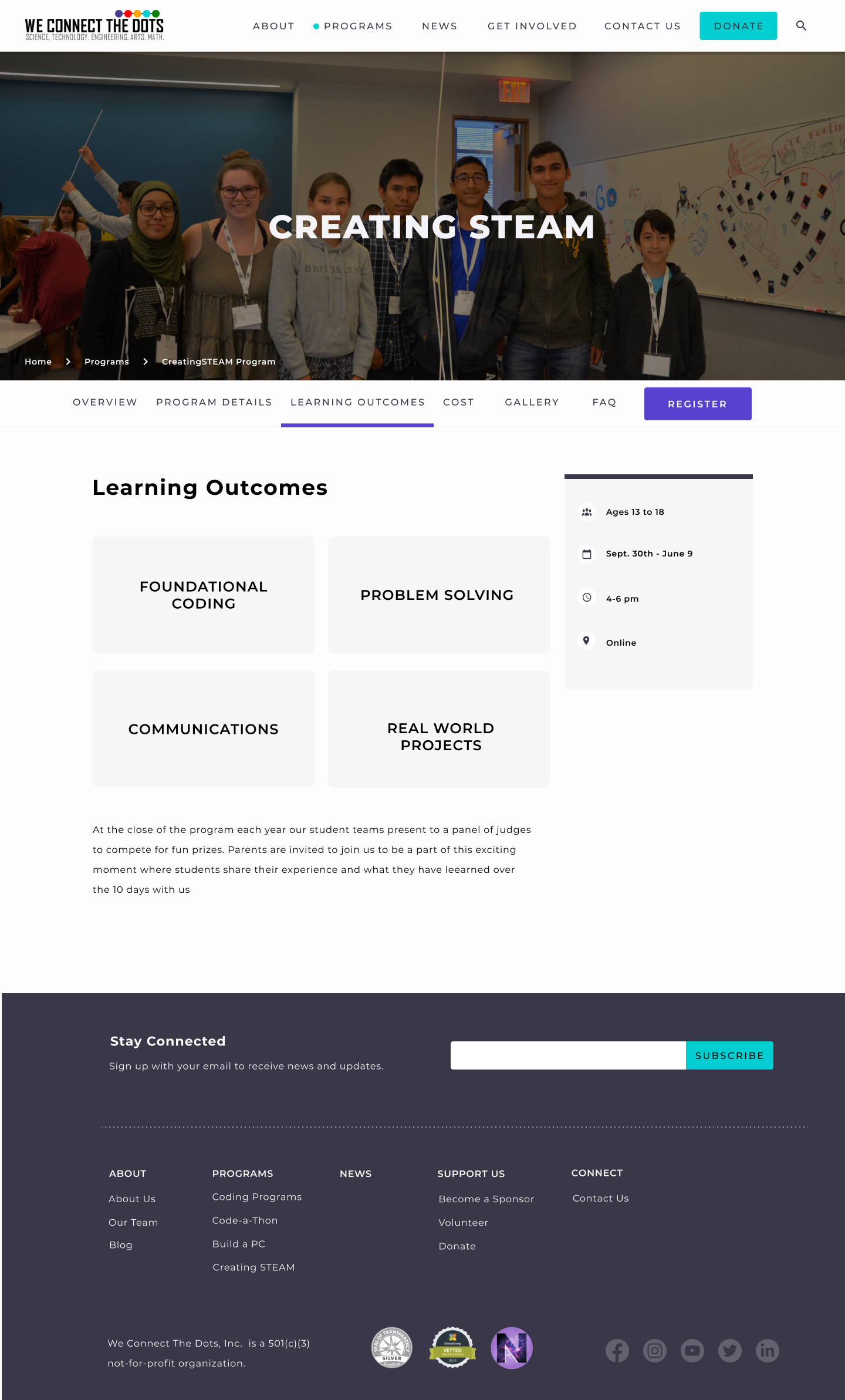
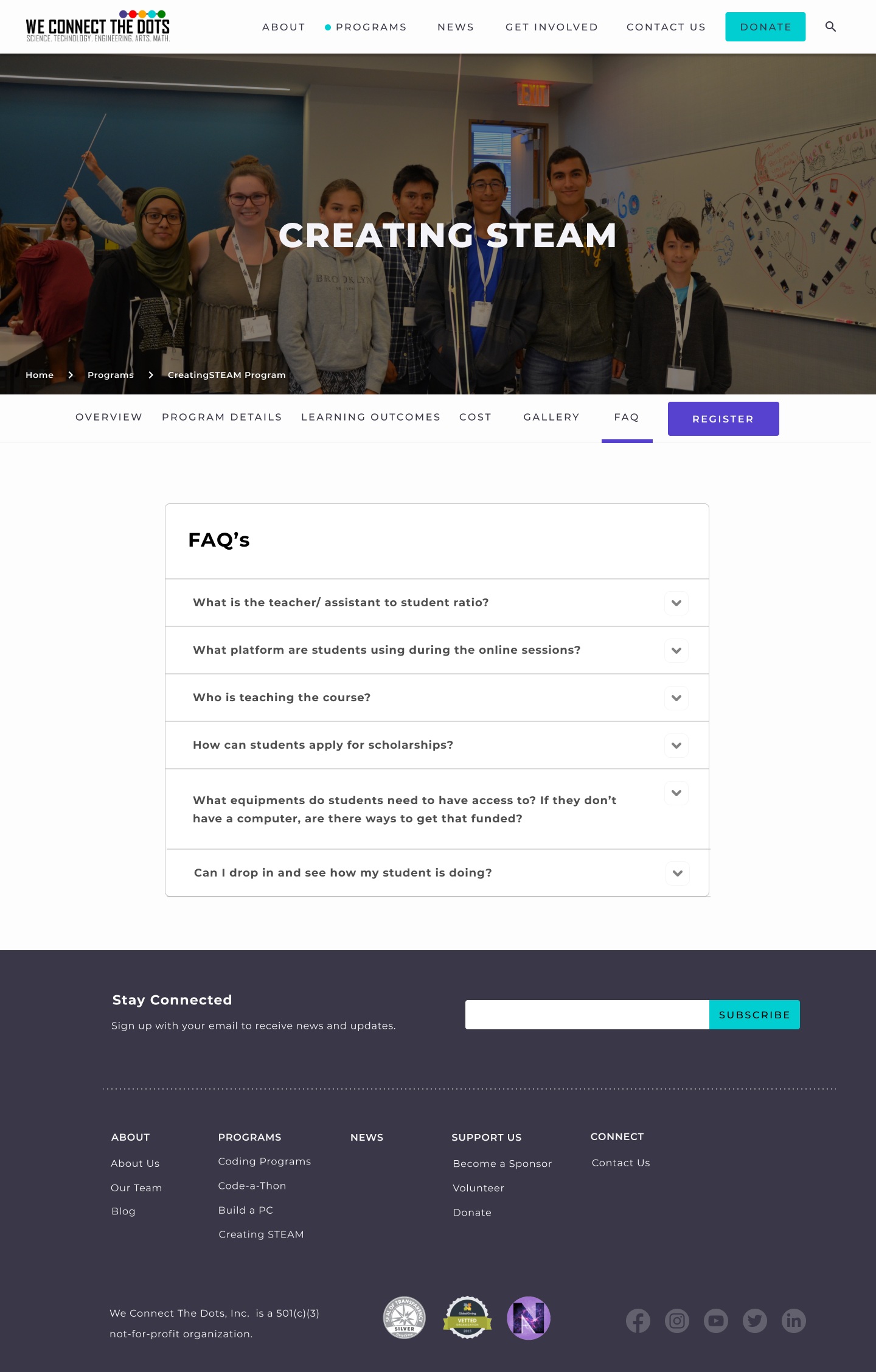
We divided thee work between the designers so we were each responsible for creating a certain section. I was responsible for the Programs section. I began by creating sketches, then moving on to wireframes and low-fi prototype. I conducted user testing on the low-fi prototype to determine where I needed to make changes. I discovered the type of program information users were looking for and what type of layout was most effective for relaying that information. I then created a hi-fi prototype and again conducted more user testing. A couple more iterations were made and helped create the final prototype.


